
Brief
For this project we have been asked to design a typeface cohereing with the theme 'Migration'. We will design all the letters from A-Z and then present the typeface in the form of a poster that best shows off our creations.
Research
I firstly gathered some images of Typefaces I liked the look of. I wanted to focus on the migration and movement of Liquid and use this element to create letters that represent this best. I also liked the look of splashed ink on pages and ink blots, I think that could look pretty interesting. I could maybe use the flow of liquid to make it naturally look like a letterform.

Rorschach Inkblot test
The Rorschach Ink test is a projective psychological test that was created in 1921 by a Swiss psychologist named Hermann Rorschach. It's used to assess personality and emotional functioning in someone. Someone who is being assessed will be shown 10 Inkblot cards that are in an array of designs, and the psychologist will assess the persons response in how they describe that inkblot picture. It was used to identify schizophrenia and other mental health problems.


First Drawings
These are my first initial sketches of different typefaces. I like the use of the little lines as I feel it adds a little detail. I did find it had to create the same shapes for the middle letters, so going into illustrator I feel will help a lot when piecing together all the letterforms.

After our feedback session, I felt like I had more of an idea on what I wanted to do. I needed to focus on creating natural waves in letterforms using paint or ink. This would create the most realistic outcome and also look more authentic! so I gathered my paint and ink and began to experiment.
I started off by folding the page in half, just so I know the letter will be symmetrical! I started off with letters that are symmetrical such as A,E,T etc. these were pretty easy, it was just a case of doing it a few times to find the outcome I liked the most and felt worked the best. The other letterforms that are unsymmetrical we're a little bit trickier to do, such as J,N,Z etc. I used a straw and blew the liquid across the page to help create the shape as natural as possible, but had to make a few tweaks with a cocktail stick to drag the paint a little bit to make it more cohesive.
I started off by folding the page in half, just so I know the letter will be symmetrical! I started off with letters that are symmetrical such as A,E,T etc. these were pretty easy, it was just a case of doing it a few times to find the outcome I liked the most and felt worked the best. The other letterforms that are unsymmetrical we're a little bit trickier to do, such as J,N,Z etc. I used a straw and blew the liquid across the page to help create the shape as natural as possible, but had to make a few tweaks with a cocktail stick to drag the paint a little bit to make it more cohesive.
Inkblotting Experiment
Next, I scanned in all the pages and added them into illustrator. One by one I organised and edited each letter to make sure they were easily readable and all cohered with each other. Using image trace to add the threshold gave it its pure black form and made it more usable for display text usage.
I imported the image into photoshop and messed around with the letters a little bit to see what I could do with them when it came to creating a poster to show off my typeface. The outcomes were pretty interesting and feel it will have a really fun overall outcome to my work.
I imported the image into photoshop and messed around with the letters a little bit to see what I could do with them when it came to creating a poster to show off my typeface. The outcomes were pretty interesting and feel it will have a really fun overall outcome to my work.


I used a website called calligraph.com to upload my letters. this was a good way to have all my letters in one space and it was pretty simple.


Poster Research
For the poster I wanted to incorporate the movement of ink with the text. I did some research and collected some images of posters I liked the look of, I feel like I swayed more towards black and white images with interesting positioning and intricate designs. I particularly liked the smudge text because it gave me a look on how I could use that particular typeface and have it in my design. I want my poster to look like a poster design incorporating my typeface and how it can be used in an interesting way, instead of having a collective of random letters.


I started out by deciding what I wanted to call my typeface, since it was inspired by Rorschach psychology, I wanted to include the word 'Mind'. Initially I came up with 'Mind ink' which I quite liked but then decided on 'Mind Spill' as I felt this was better as it incorporated the word 'mind' but also the spill of the ink.
I began on illustrator, `I figured out how to make my text in this circular shape which was fun to experiment! I tried to make the words look like they pooled into the ink naturally but began to find this quite difficult, so I took a different approach and went into photoshop and played around with the liquify button. I distorted the text first to make it look as though it was leaning back and dripping into the page. I used the filter gallery to experiment with different looks.
I began on illustrator, `I figured out how to make my text in this circular shape which was fun to experiment! I tried to make the words look like they pooled into the ink naturally but began to find this quite difficult, so I took a different approach and went into photoshop and played around with the liquify button. I distorted the text first to make it look as though it was leaning back and dripping into the page. I used the filter gallery to experiment with different looks.


As you can see I played around with many different filters photoshop had to offer. I paticurarly took a liking to the 'chrome' filter, which gave it a hand drawn and interesting feel. I played around with how intense I wanted the black to be and also altered the threshold to thicken up some lines to make it more visible.


I decided to add a background colour, as I felt the white was too stark and hurt the eyes a little. changing the background made it easier on the eyes and made it better to look at overall. I added the text and messed around with the positioning of the text to compliment the image. I wanted to make the image the focal point of the poster as I wanted the viewer to see what interesting ways you can use my font for their projects. This was my final poster before my feedback session.
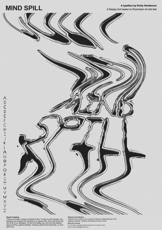
Improvements needed:
the improvements I need to make on my poster is to make more use of my own font in the text instead of the Ariel typeface! and to have some lowercase or numbers complimenting the letters on the left. also experiment with colour (perhaps red) and see what that would look like.